
ICYE Visual identity
ICYE, a global federation based in Berlin with member organisations in 41 countries, approached me with a clear goal: to refresh their visual identity. They needed a system that could work across different regions and cultural contexts, while being simple, recognisable, and easy to implement. The new identity had to reflect the organisation’s youth-driven spirit, but also maintain a sense of institutional trust — striking a balance that would speak to both young people and key stakeholders.

The federation needed a branding solution that could unify their international network while accommodating the varying realities and resources of their local members.
The federation needed a design branding system that could unify its international presence while respecting the different contexts, capacities, and tools of its local teams. It needed to be practical: adaptable to the varying capacities of local teams, and accessible enough for staff to use confidently in their day-to-day communications.
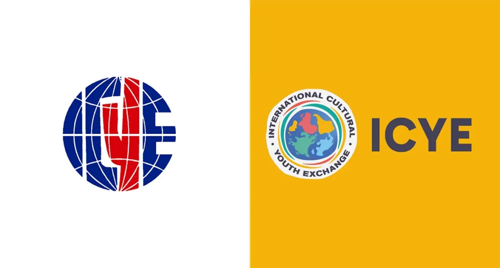
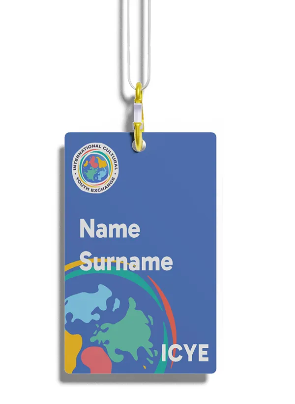
I began by conducting research with ICYE members to better understand their needs and perspectives. Their existing logo had remained unchanged for nearly 30 years and held significant sentimental value, so the process required care and a deep sense of listening.


Based on these insights, I created a refreshed visual identity that reflects the federation’s values, while staying practical and easy to apply across their network.
ICYE’s unique map projection
A key element of the rebrand is the ICYE world map, inspired by the Werner projection — a pseudoconic, equal-area map designed to present all continents in a shared global view. Oceania was repositioned to reflect ICYE’s commitment to global balance and avoid a Eurocentric frame.
South-up map orientation as a statement
The map is also oriented south-up — a deliberate design choice that aligns with ICYE’s values. This orientation challenges dominant worldviews, encourages critical thinking, and supports the organisation’s goal of promoting solidarity and more equitable partnerships.
Beyond visual concept and symbolism, the project focused on practicality. The visual identity includes a flexible colour palette, accessible typography, and adaptable templates designed for ease of use in tools like Canva. This allows local offices to implement the brand consistently and professionally, even with limited resources.

Empowering a global federation with a user-friendly, ready-to-use , visual identity.

The updated identity also introduced a set of custom icons to support communications and position ICYE as a youth-centred, globally minded organisation — one that remains rooted in its institutional role, while speaking in a more vibrant and approachable visual language.


